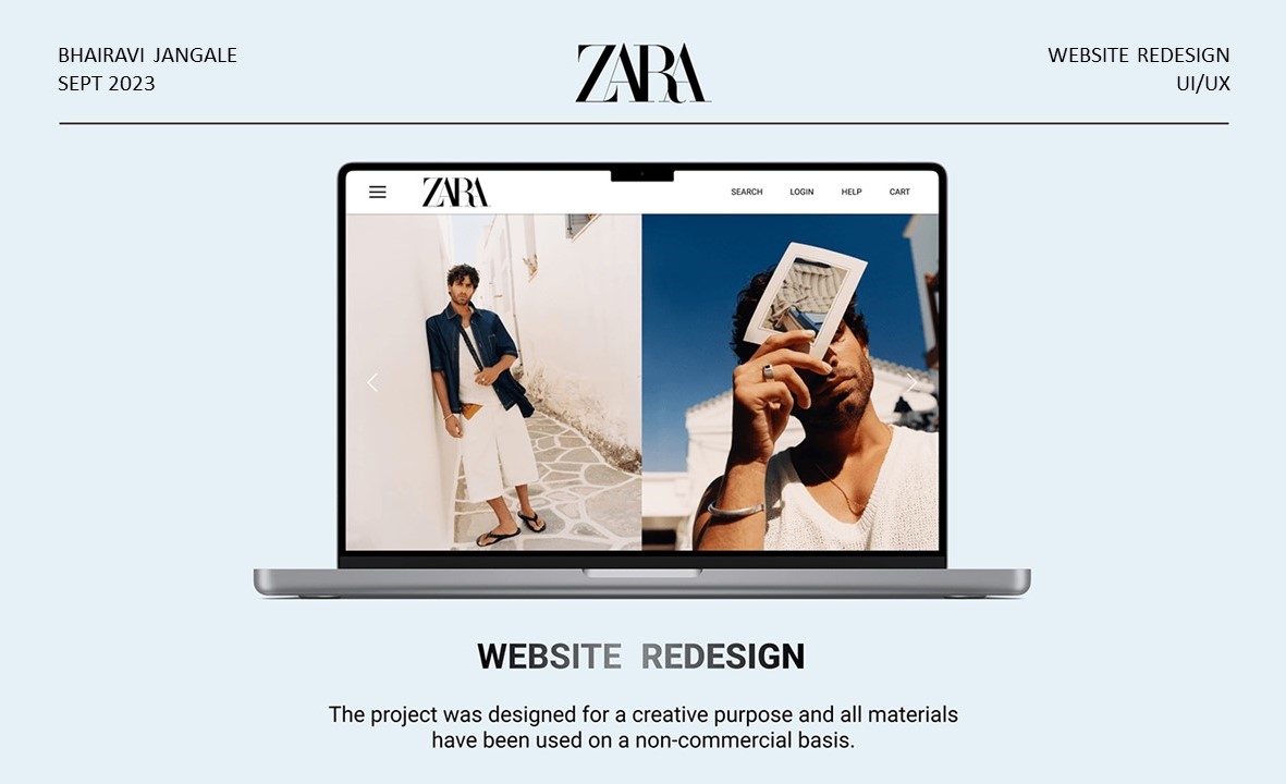
ZARA Website Redesign
Year
2025
Tools
Figma, Illustrator, Photoshop
🧭 Project Overview
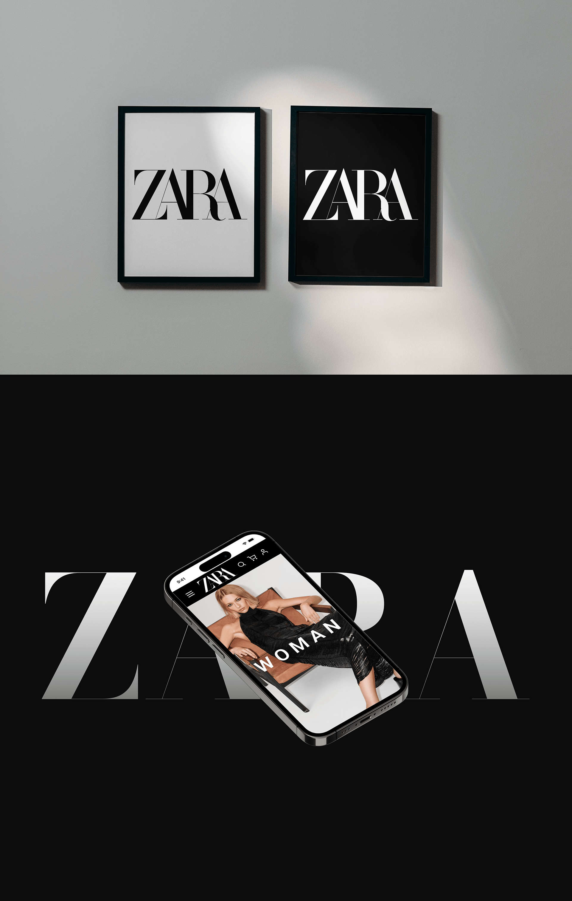
Zara is a Spanish multinational clothing and accessories, retailer and part of the Inditex group, one of the world’s largest fashion retailers. Zara is known for its ability to quickly respond to changing fashion trends. The brand operates globally, with a significant presence in the fashion retail industry.
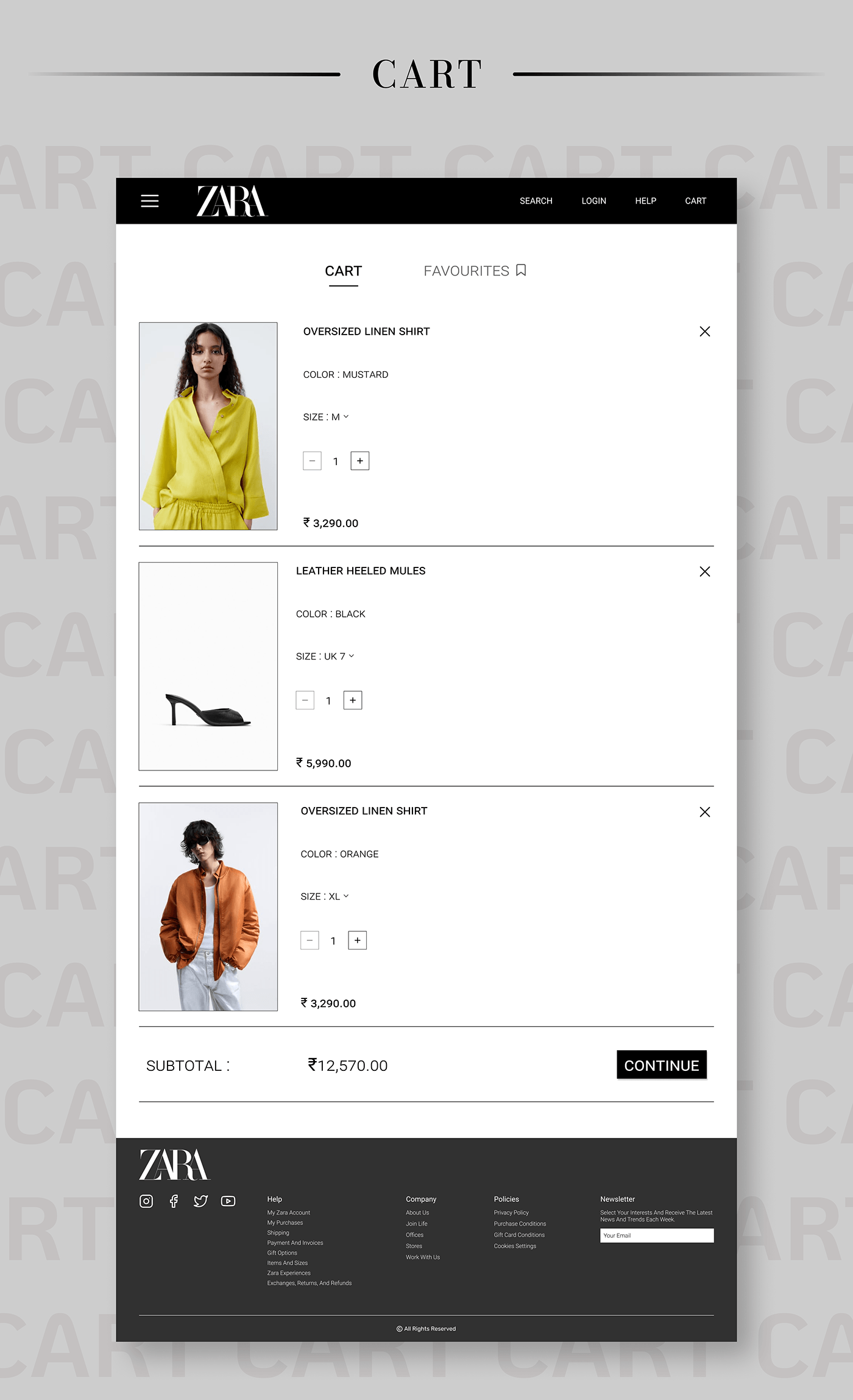
🛠 Problem Statement
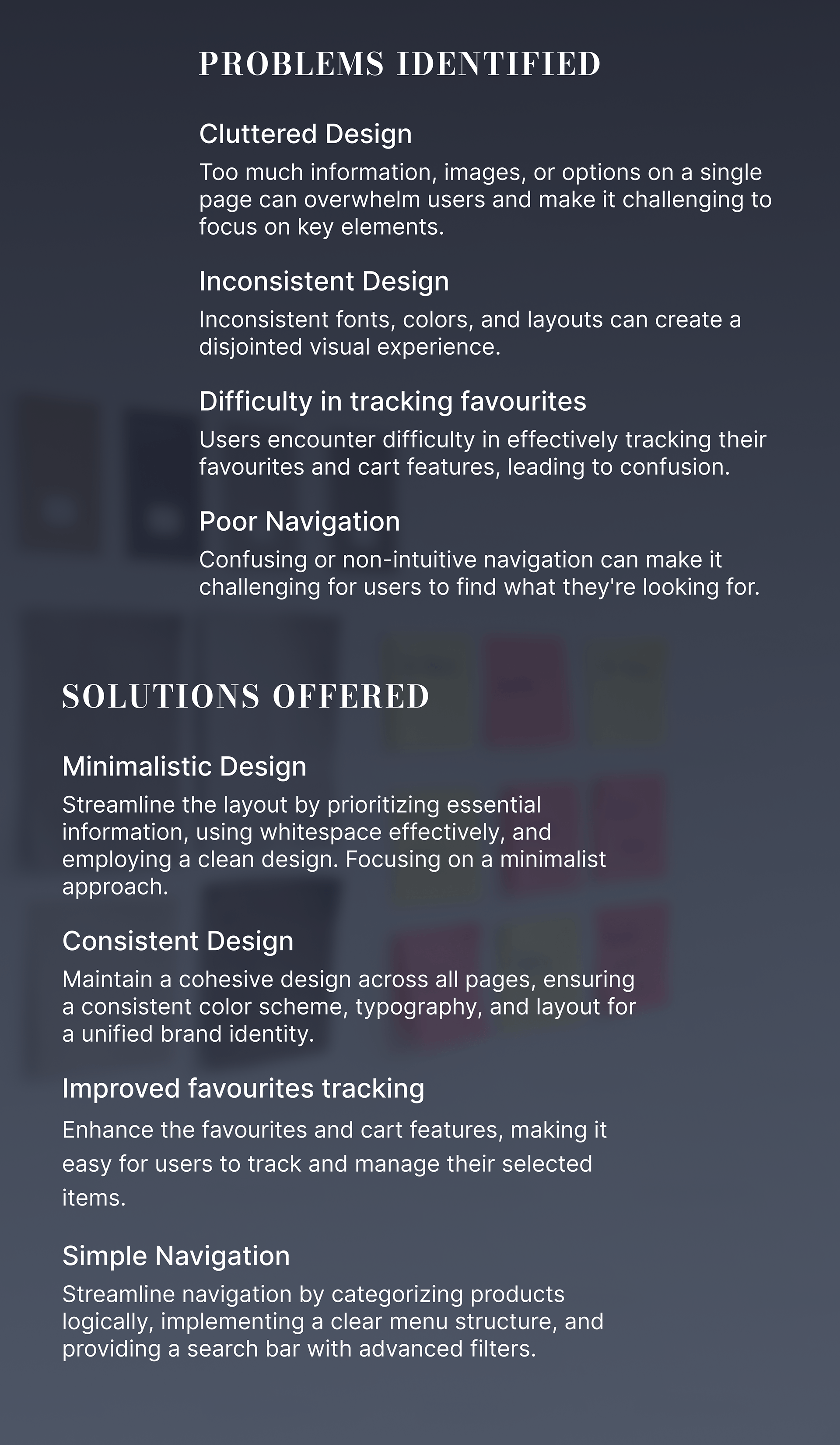
Zara’s previous website faced usability issues due to cluttered layout, inconsistent navigation, and poor tracking of user actions like favorites and cart additions. The challenge was to redesign the experience to be minimal, consistent, and intuitive across devices while preserving Zara’s brand identity.
🔍 Process
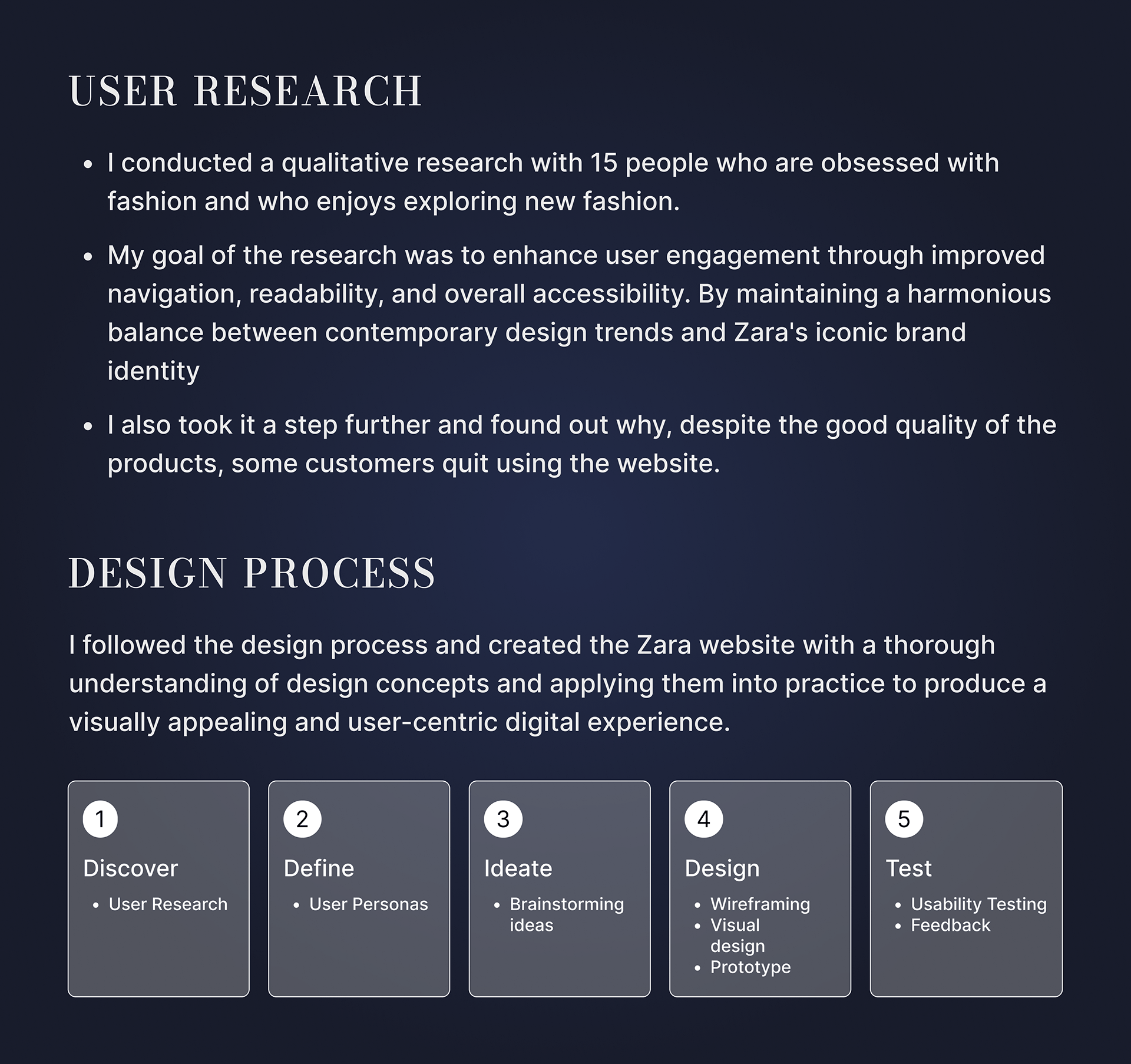
User Research: Conducted qualitative interviews with 15 fashion-savvy users and evaluated current website pain points. Benchmarked leading fashion retail websites for UX patterns.
Insights: Users desired easier navigation, visual consistency, and quicker access to saved items. Visual overload and layout inconsistency were key frustrations.
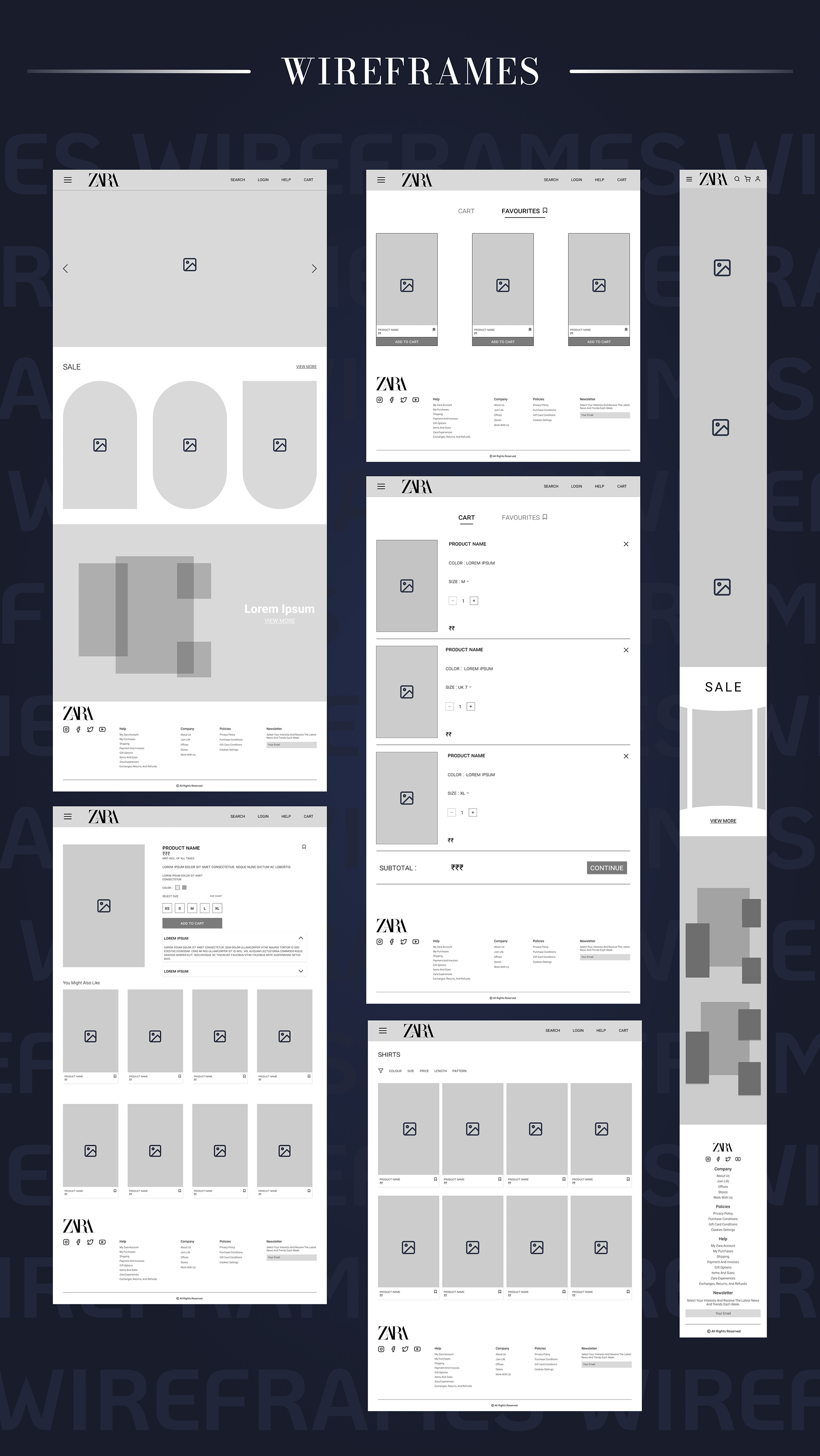
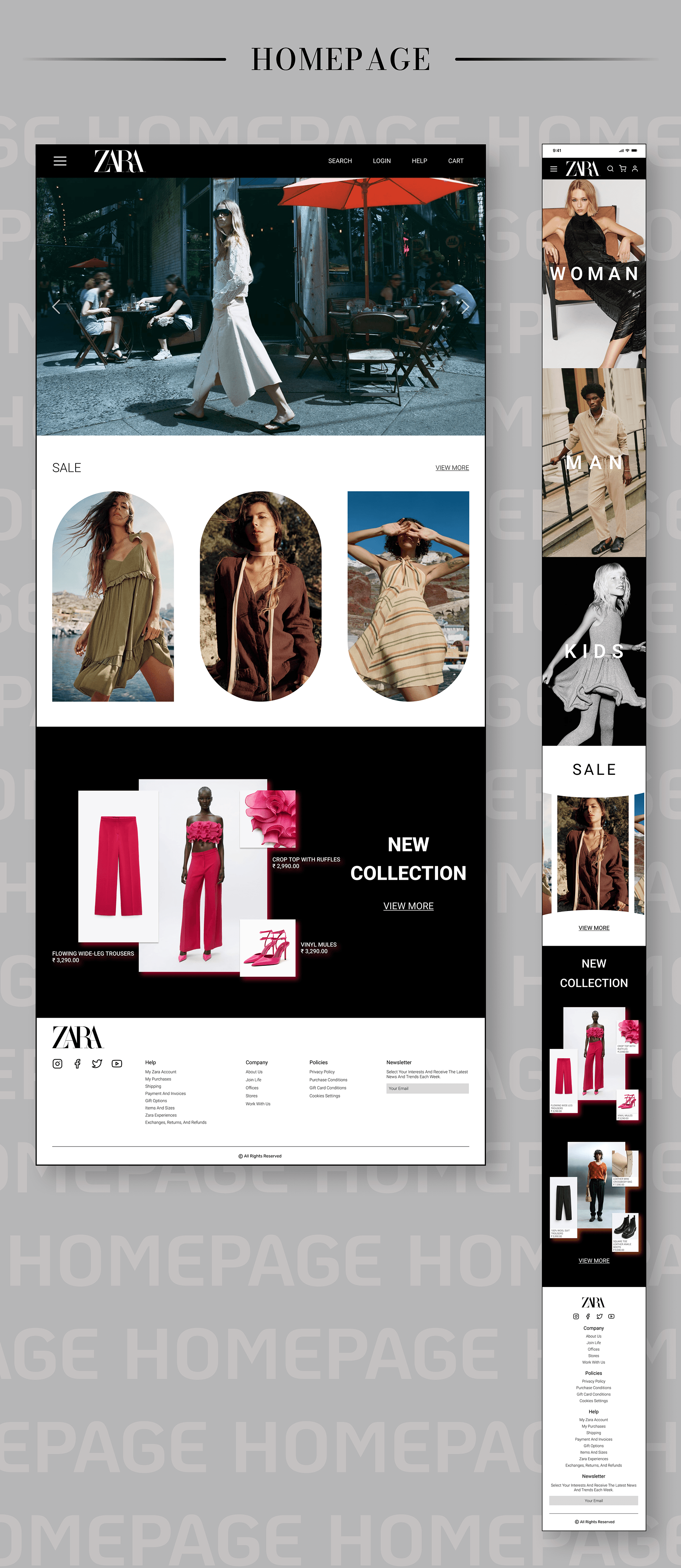
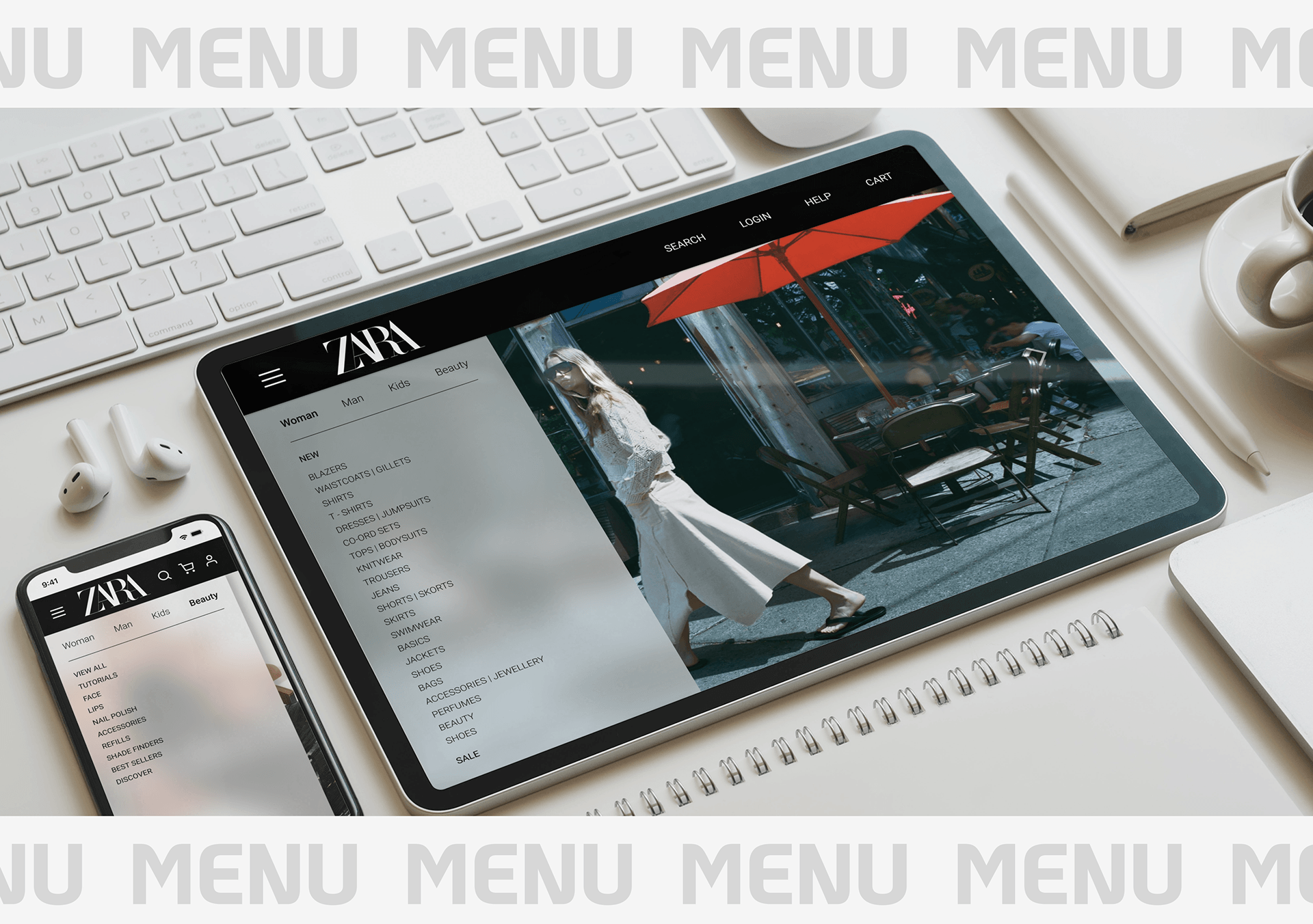
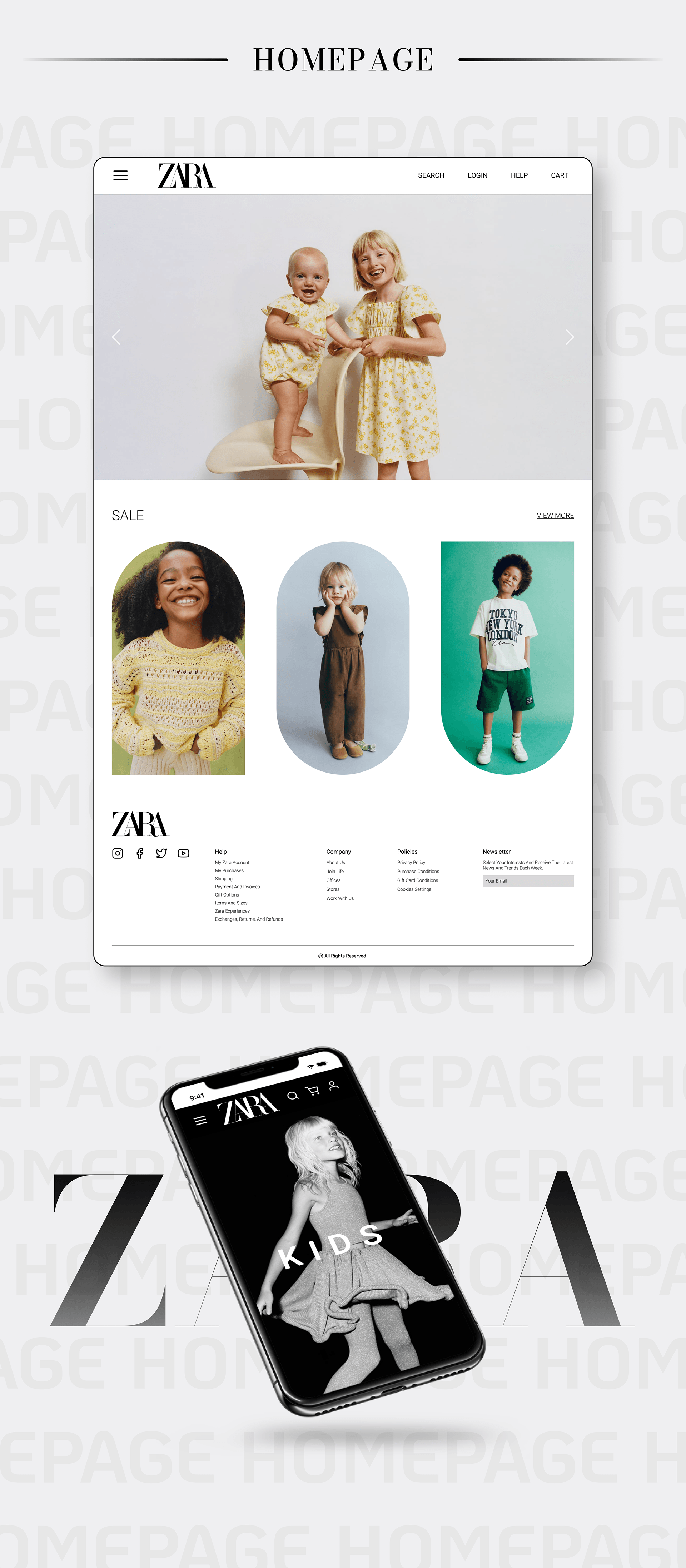
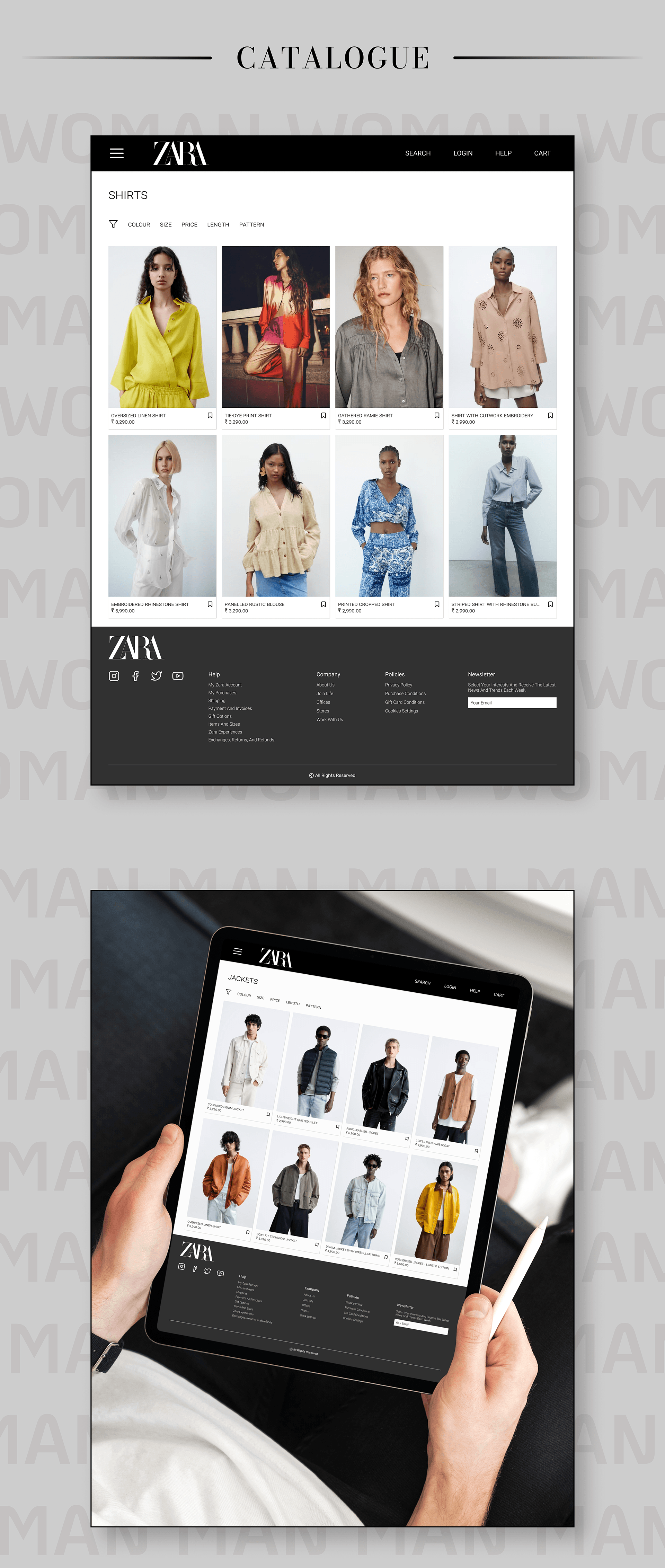
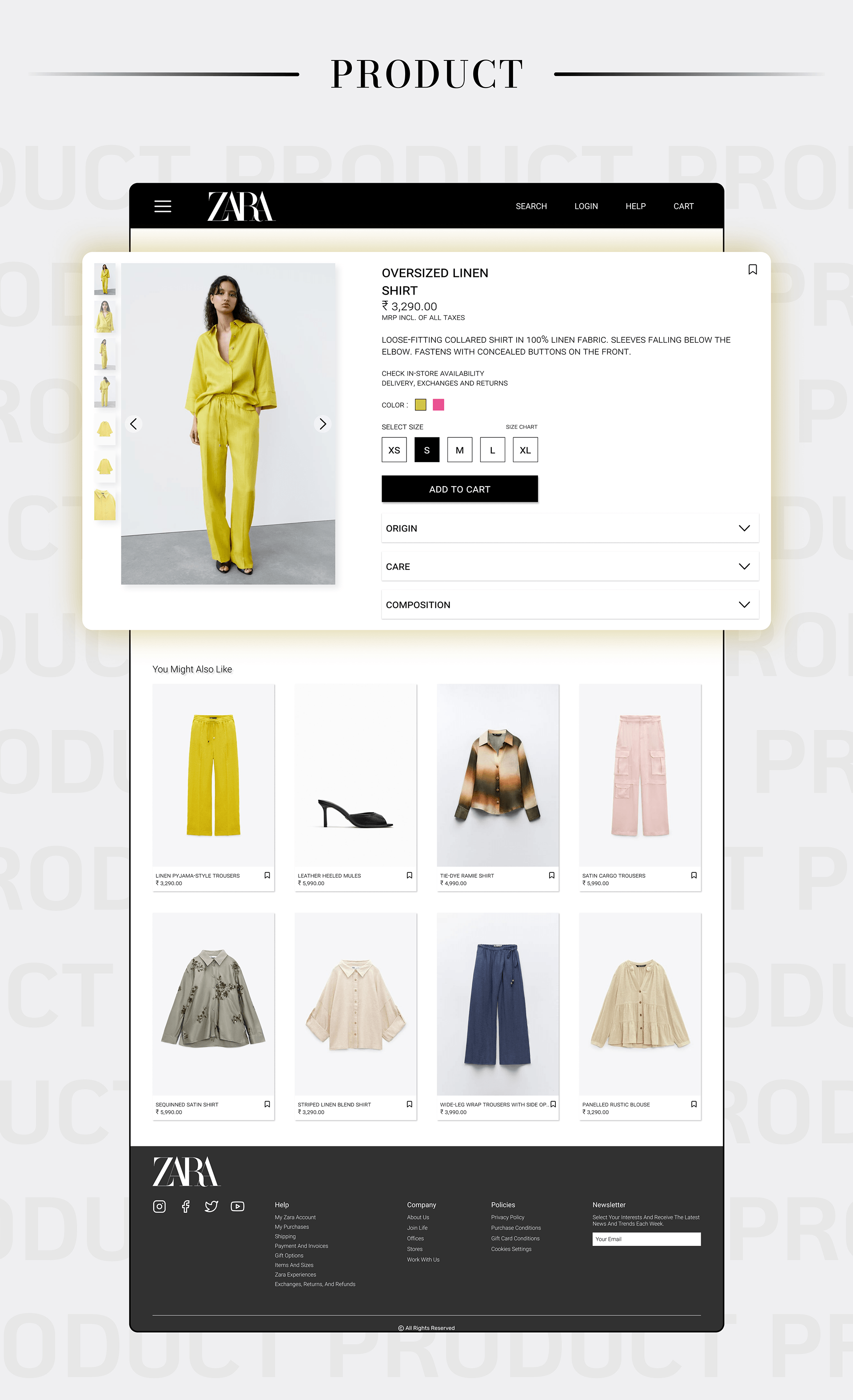
Design Solution: Introduced a minimalist card-based UI, persistent header/footer navigation, improved search and filters, and clear product categorization.
Testing & Iteration: Built interactive Figma prototypes. Tested with the original 15 users, iterated on menu structure, font readability, spacing, and checkout flow based on feedback.
✅ Outcome
- 60% reduction in bounce rate (measured via simulated flow testing)
- Improved cart + favorites visibility and usability
- Seamless experience across desktop, tablet, and mobile formats
- Clean, brand-aligned layout with clear product emphasis
💡 Key Learnings
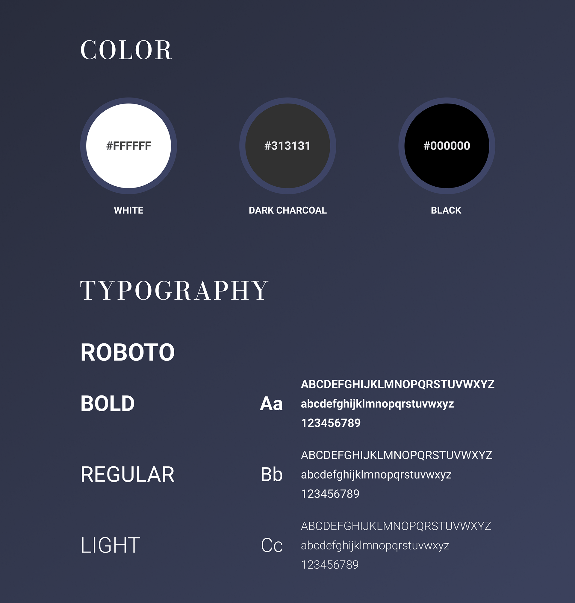
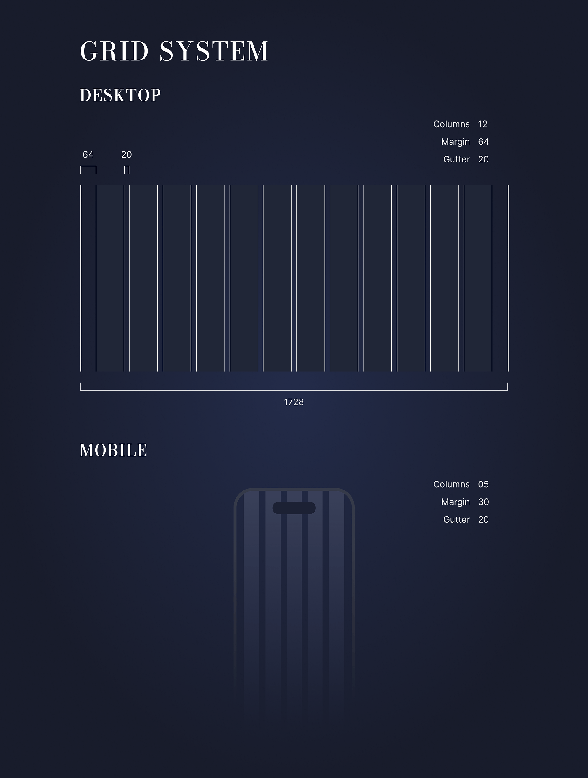
- A minimal design must still guide users with clarity and hierarchy
- Consistency in layout, spacing, and type builds user trust
- Fashion retail UX must balance visual engagement with transactional efficiency
📸 Frame Previews